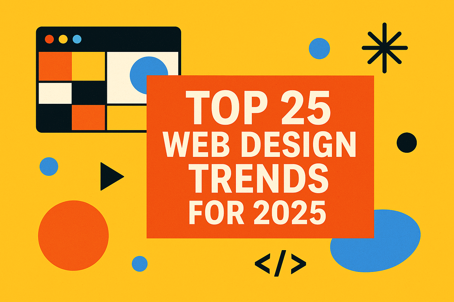

Welcome to our “25 for 25” rundown—your go-to guide for the top 25 web design trends shaping 2025. This year’s design ethos is all about interactive storytelling, bold visuals, and human-first experiences. Whether you’re a web dev looking to impress clients or a brand revamping your digital presence, this list is your cheat sheet to staying ahead of the curve.
🚀 Interactive and Immersive Experiences
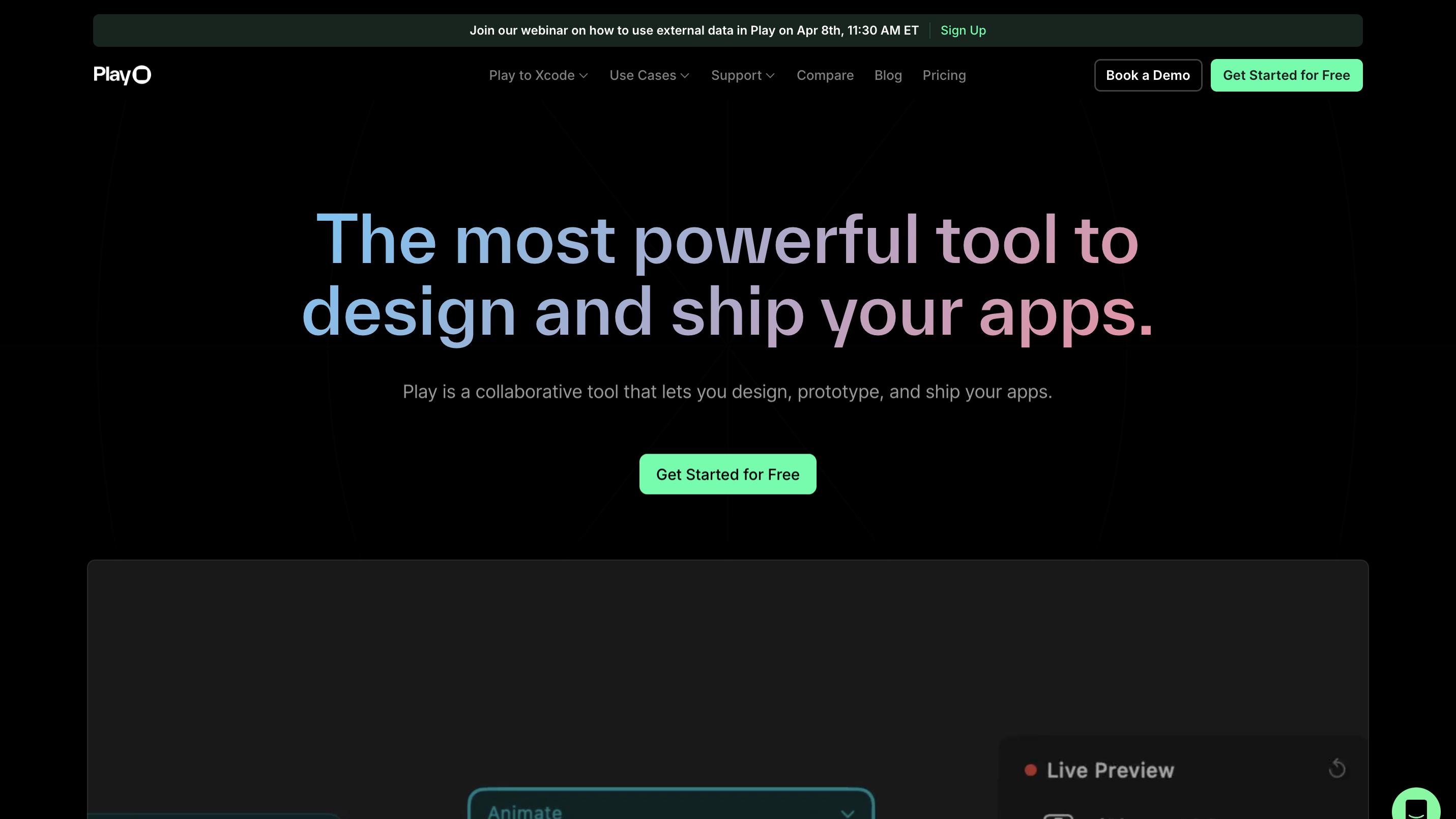
1. Micro Animations
Micro animations are subtle movements used to guide user behavior and elevate a site’s usability. They show up in places like hover effects on buttons, form input validation, or dynamic tooltips. When done right, these animations feel natural and help users intuitively understand how to interact with your site. They add polish without becoming a distraction, making your UI feel alive.
2. Cursor Animation
Forget the standard pointer—custom cursors are now part of the brand experience. Websites are turning cursors into animated elements that reflect a site’s personality, from trailing particles to interactive morphing shapes. These little details deepen immersion and make every interaction feel unique.
3. Scroll-Triggered Animations
Scroll-triggered animations activate visual elements as the user scrolls, transforming static pages into interactive experiences. Elements can slide, fade, zoom, or morph into place, revealing content with dramatic effect. This is perfect for storytelling-focused sites and landing pages where each scroll feels like turning a page.
4. Experimental Navigation
2025 is giving traditional navigation the finger (respectfully). Instead of dropdown menus and hamburger icons, we’re seeing radial menus, scroll-to-navigate pages, and gesture-driven interactions. These designs prioritize surprise, memorability, and aligning nav with the brand’s vibe.
5. Non-Traditional Scrolling
Scrolling is no longer just up and down. Sites are embracing horizontal scrolling, scroll snapping, and diagonal movement to create immersive user flows. Combined with smart animations, it can feel like navigating a digital storybook or gallery.
🎨 Visual Design Elements
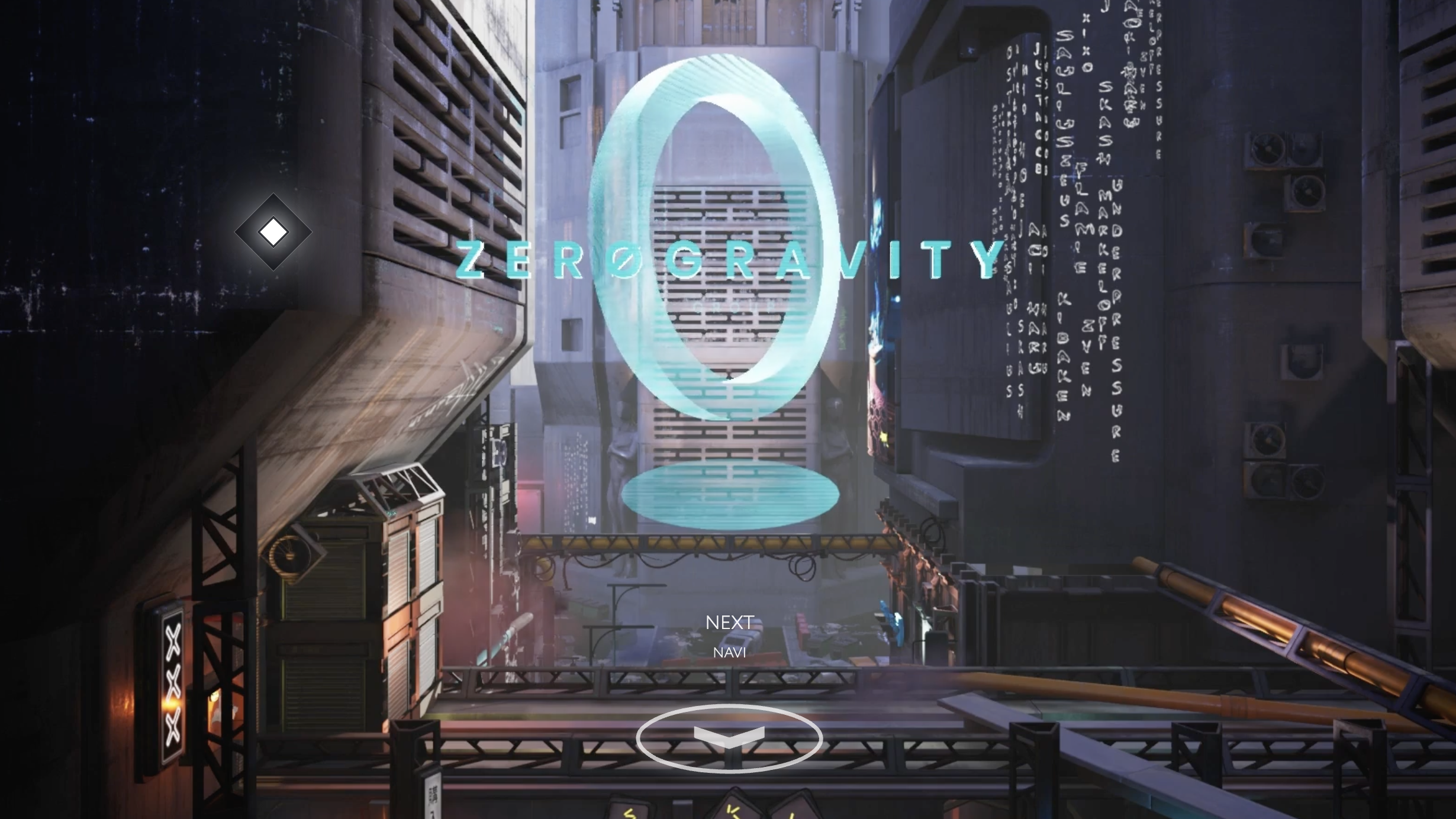
6. Futuristic, Sci-Fi Gaming UI Aesthetics
Designs are taking cues straight from the latest sci-fi and gaming interfaces—think glowing edges, glitch transitions, holographic overlays, and neon-accented elements. These UIs often include layered motion graphics, ambient soundscapes, and interactive hover states that mimic in-game HUDs. Perfect for tech-forward startups or any brand aiming to look ahead of its time.
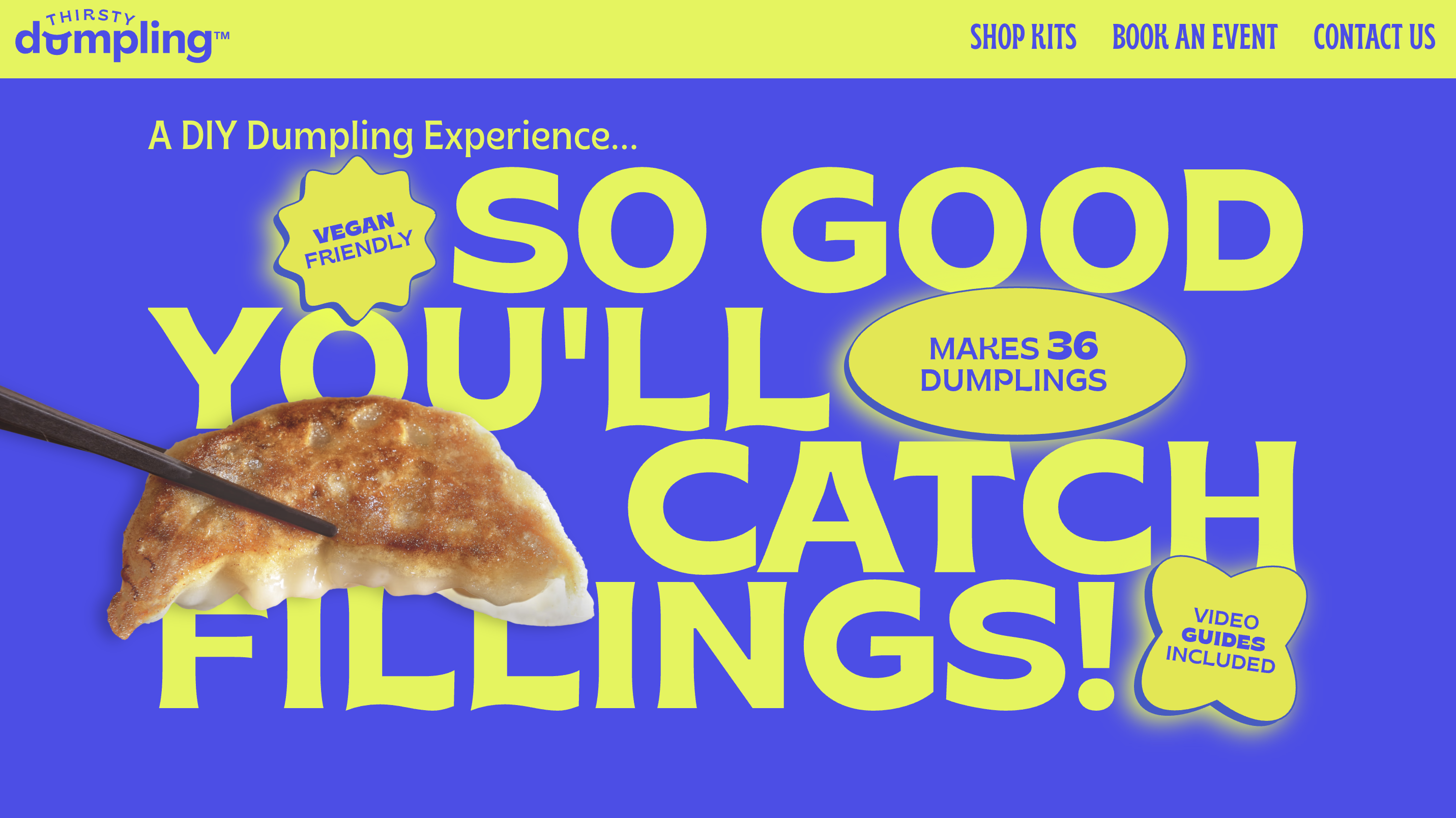
7. Brutalist Design
Brutalism in web design embraces the rough, the raw, and the unapologetically bold. Expect thick borders, oversized typography, and intentionally clunky layouts. It’s the design equivalent of smashing the “pretty” button off your keyboard—minimal styling, high contrast, and lots of attitude. You might even recognize some brutlist elements in this website.
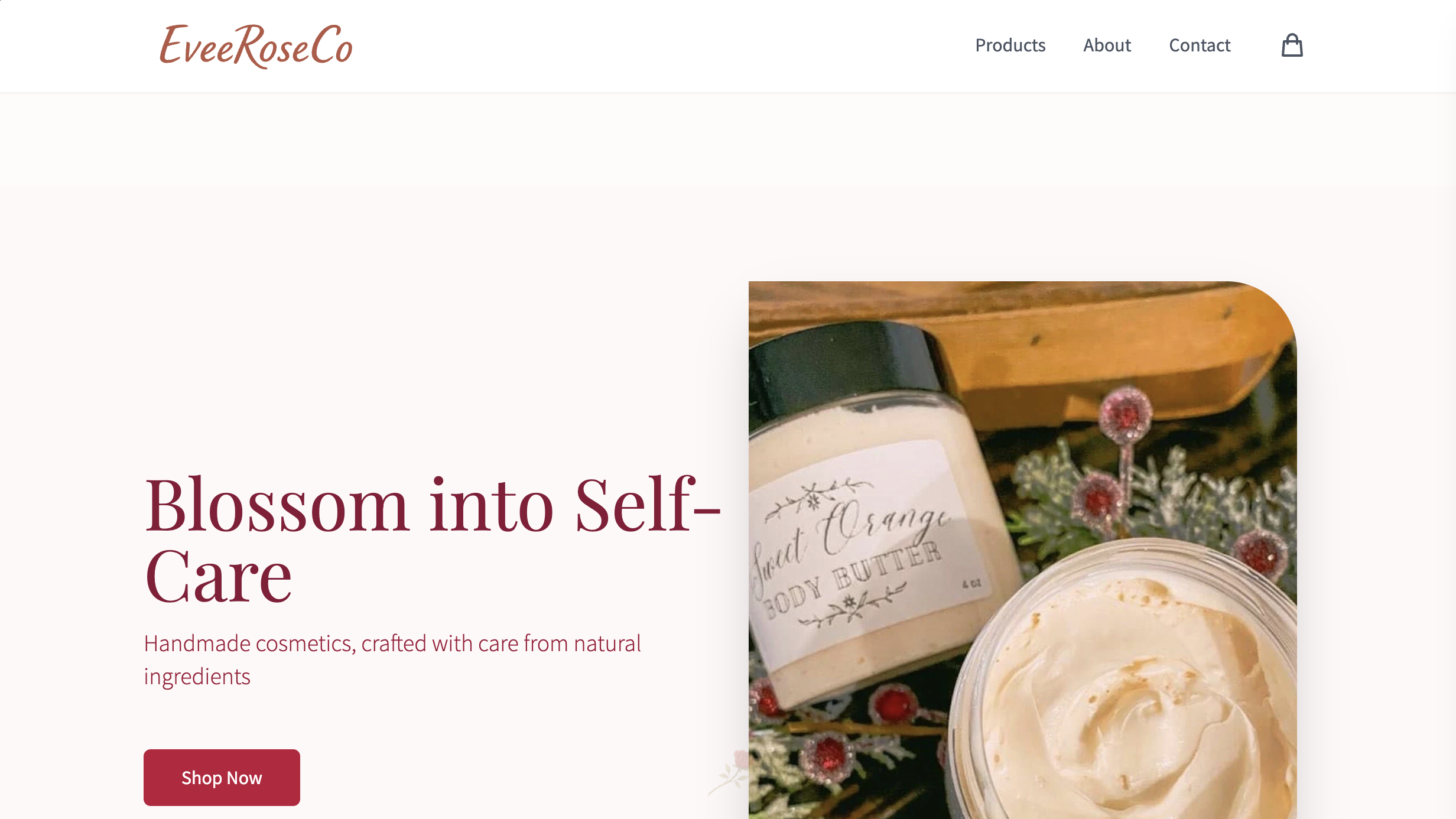
8. Organic Matter
In contrast to the cold digital aesthetic, many designers are leaning into earthy textures, natural color palettes, and flowing, organic shapes. This style mimics the look and feel of physical, natural elements—water, wood, leaves—and helps create a more human, grounded connection with users.
9. UFOs (Unexpected Floating Objects)
UFOs—whimsical floating elements—are popping up across modern designs to add visual intrigue. These gravity-defying shapes float in, rotate, or hover in unpredictable ways, creating a sense of play and dynamism. They often break the grid and challenge conventional layouts in fun ways.
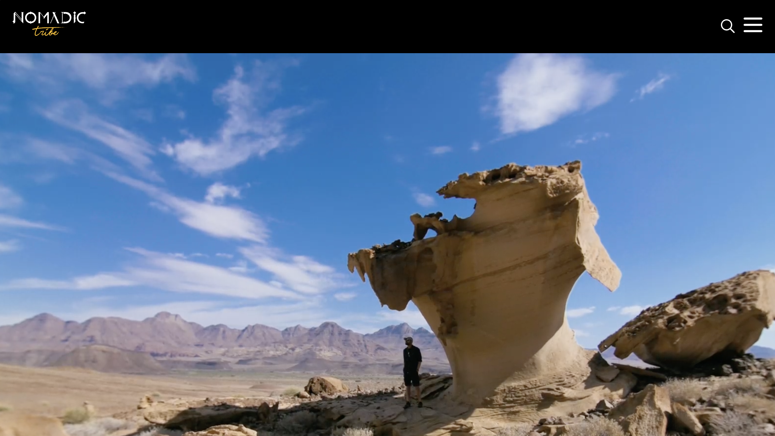
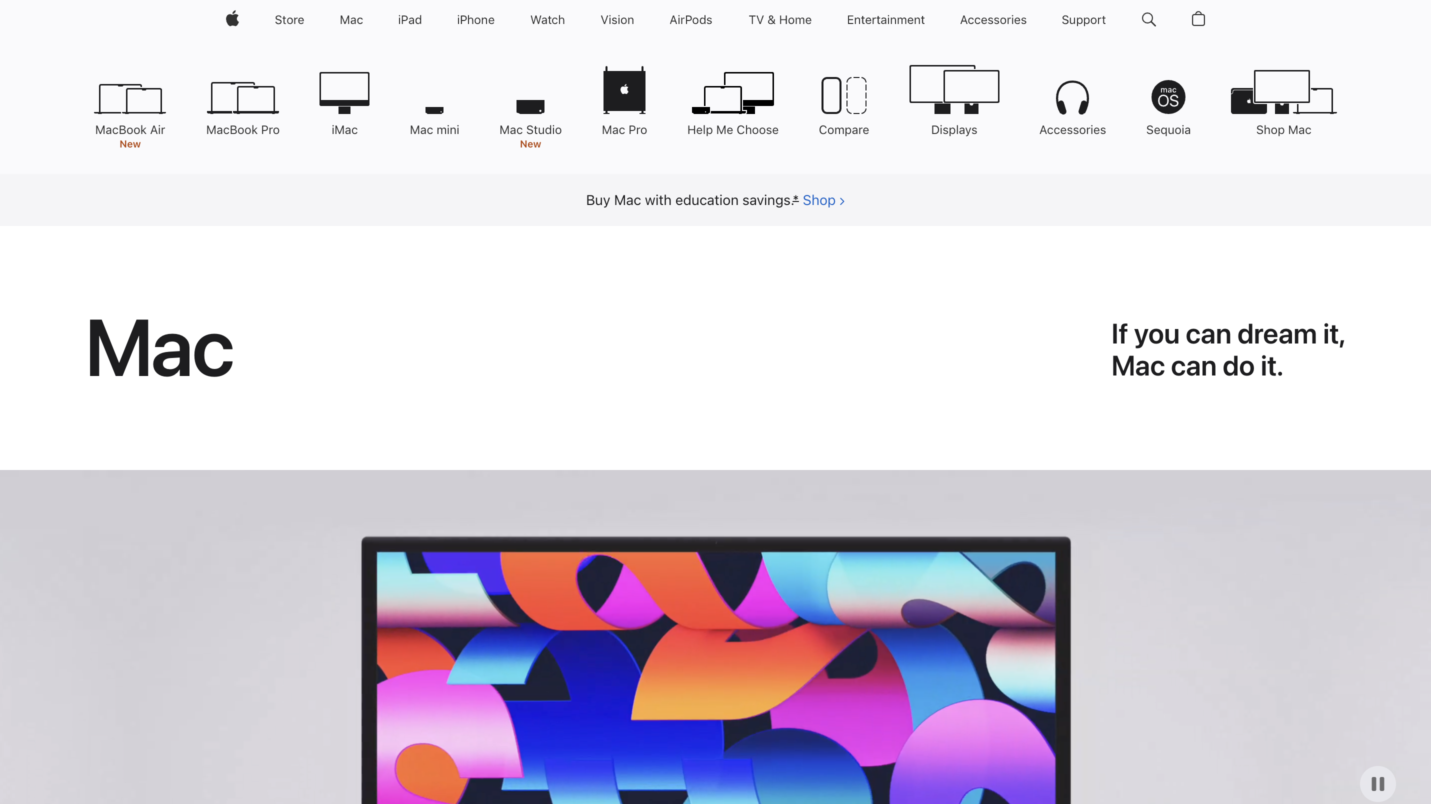
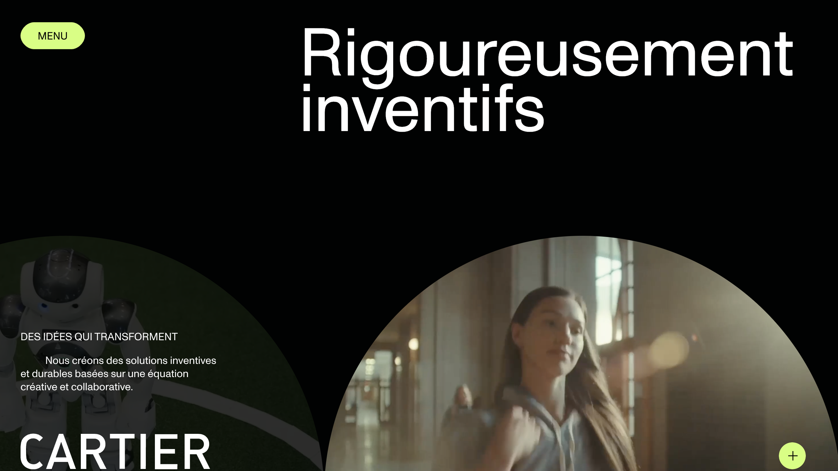
10. Full-Screen Headers
The top of your page is prime real estate, and designers are going big. Full-screen headers often split the screen into a striking image or video on one side, and bold text or call-to-actions on the other. It’s a high-impact way to immediately hook a user.
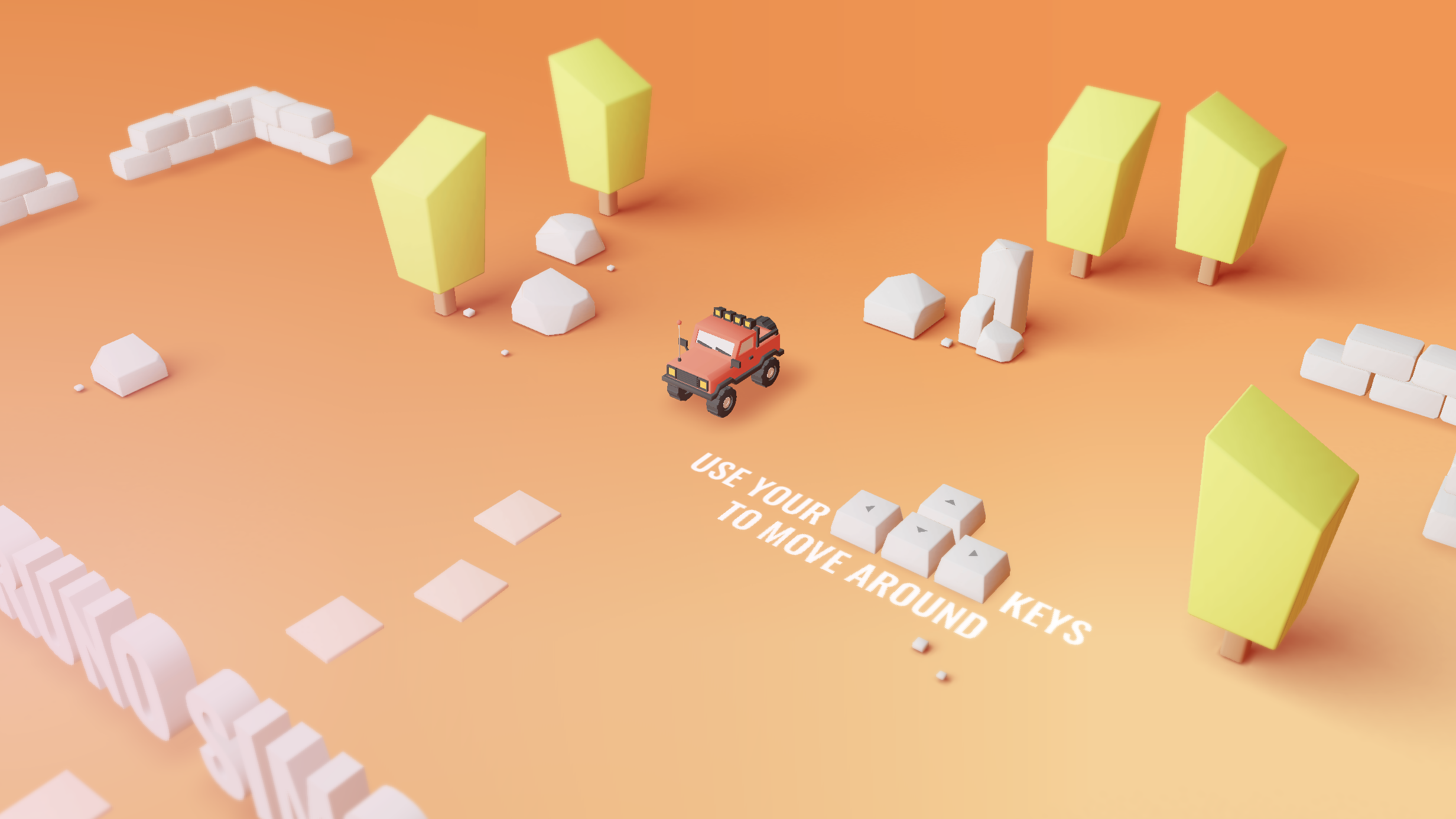
11. 3D Websites
3D design isn’t just for portfolios anymore—product demos, data visualizations, and interactive scenes are being rendered in-browser. These elements add a sense of tangibility and depth, giving users something to explore instead of just skim.
🧱 Layout and Structure
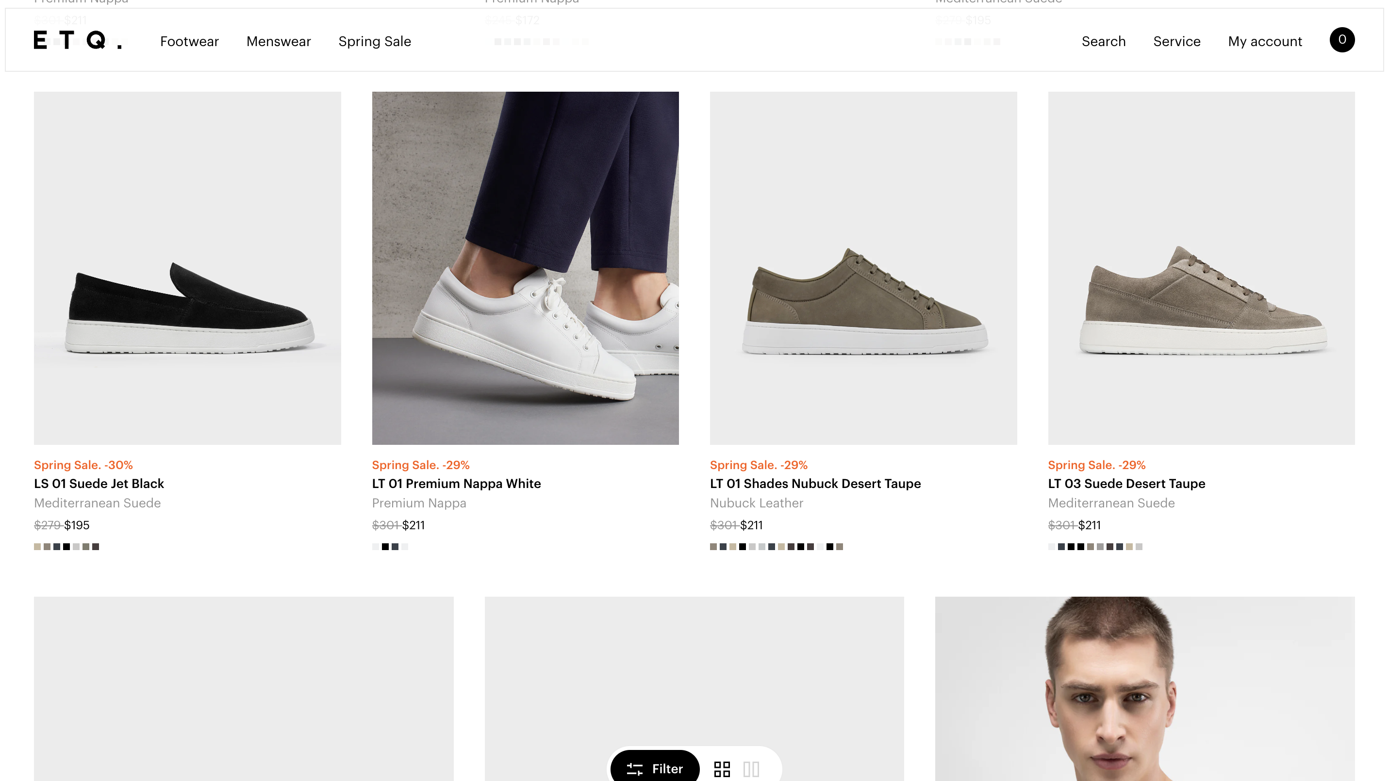
12. Bento Grid / Bento UI
Inspired by Japanese bento boxes, this layout organizes content into clean, modular chunks that feel digestible and organized. Each section or card functions as its own little micro experience—perfect for portfolios, dashboards, or feature-rich homepages. The design supports scalability while keeping things visually cohesive.
13. Grid Design (With a Twist)
Grids are evolving from symmetrical, boxy layouts to dynamic, asymmetric designs that surprise and delight. Designers are mixing column spans, layering elements, and breaking boundaries between modules to create layouts that feel fresh without losing structure. These designs bring tension and interest while staying user-friendly.
14. Negative Space / White Space
Negative space is no longer just a nice-to-have—it’s the foundation for visual clarity in modern design. By giving elements room to breathe, designers can highlight CTAs, improve readability, and create a sense of calm sophistication. This trend works especially well with high-end brands or content-heavy sites.
🔠 Typography and Color
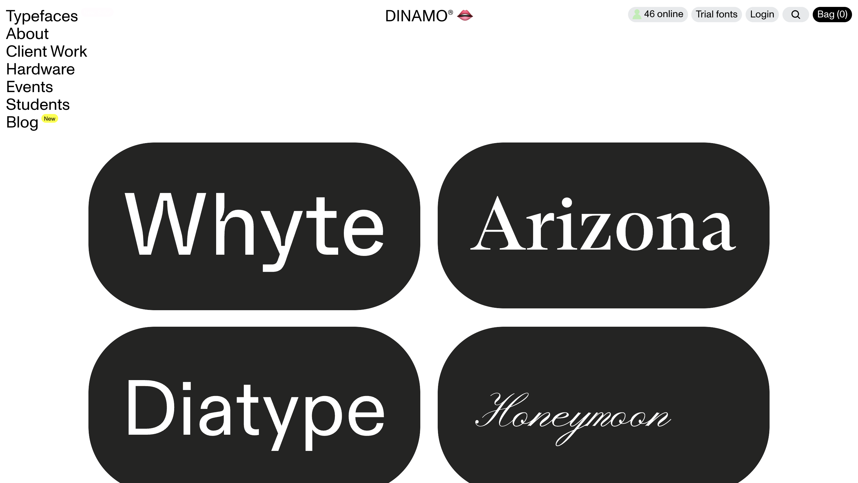
15. Expressive Typography
Typography is stepping into the spotlight as more than just a vehicle for words—it’s a full-blown design element. Big, loud, animated, and interactive fonts are being used to create mood, hierarchy, and motion. Whether it’s giant serif headers on an editorial site or kinetic typography that bounces with scroll, type is no longer shy.
16. Color Trends
Colors in 2025 are bold, but thoughtful. We’re seeing high-contrast gradients, unexpected color pairings, and layered transparencies that add dimension and mood. There’s a big shift toward dynamic color palettes that shift between light/dark modes or even change based on user input.
17. Dark Mode and Light Mode
Dual theme modes are expected in 2025, and users love the control. But it’s not just about flipping a switch—it’s about designing both experiences with intention. Good dark mode design doesn’t just invert colors; it rethinks contrast, emotion, and usability.
🧾 Content Presentation
18. Text-Only Websites
Less can be more, and nowhere is that clearer than in the rise of text-only sites. These are lightning-fast, distraction-free environments where content does the heavy lifting. They feel raw and authentic, giving writers, bloggers, and indie devs a unique way to cut through the noise.
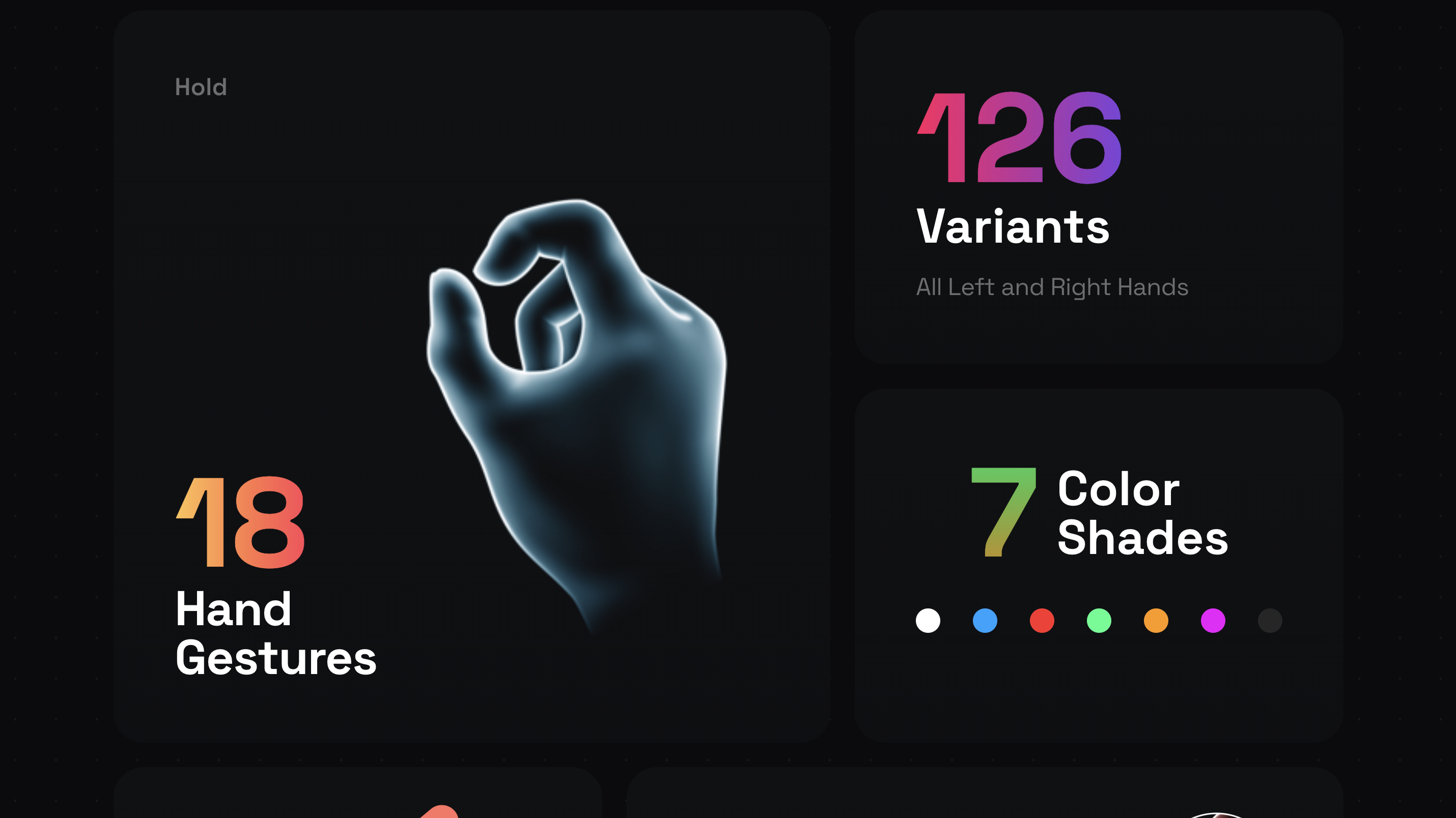
19. Custom Illustrations
Unique illustrations inject personality into your brand. Whether it’s quirky cartoon mascots, hand-drawn diagrams, or fully vectorized scenes, they help create emotional resonance. Bonus points if they’re animated or interactive.
20. Blending Images and Graphics
This trend merges photography with graphic overlays to tell more compelling visual stories. It adds whimsy, context, or contrast—think hand-drawn lines highlighting product features, or collage-style effects that bring static photos to life.
⚙️ Technical Enhancements
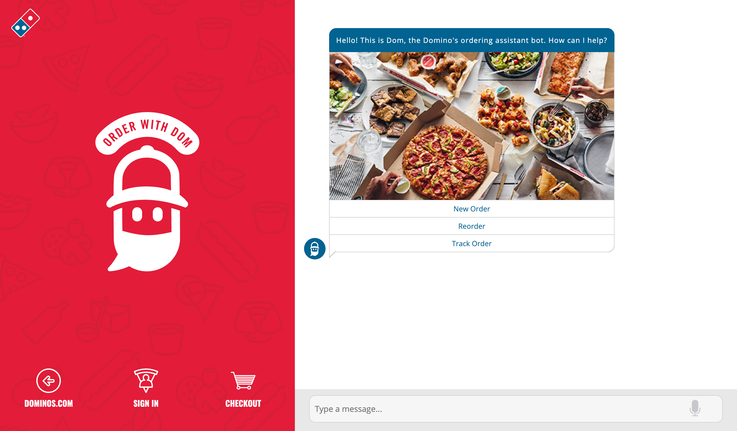
21. Chatbot Design
Chatbots aren’t just functional anymore—they’re characters. Modern bots come with branded personalities, avatars, and seamless UIs that feel like texting a human. Whether for support, sales, or content discovery, they’re now fully integrated into the visual and conversational design of a site.
22. Smart Videos
Video content has gotten smarter—lightweight, silent-by-default, and perfectly looped for engagement without dragging down performance. Great for product demos, background loops, or subtle brand storytelling that plays nicely with mobile and desktop.
23. Anti-Design
This is the chaotic good of design trends—intentionally clashing fonts, weird layouts, bright colors, and raw vibes. It’s rough, rebellious, and surprisingly effective when used strategically. Think of it as digital punk rock.
24. Increased Focus on UX/UI
Good design is invisible—but great UX is unforgettable. Designers are obsessing over micro-moments, frictionless flows, and anticipatory UI that just gets what the user wants. The smoother the interaction, the more likely users stick around (and convert).
25. Responsive Web Design
Mobile-first isn’t new—but 2025 brings it to every screen size. From foldables to widescreens, responsive design means adapting to all shapes and ratios. Designers are thinking beyond breakpoints and into fluid design that feels custom-built for every user.
Wrapping Up
2025 is proving that web design isn’t just evolving—it’s mutating. Designers are leaning into boldness, immersion, and play, all while balancing accessibility and speed. If you’re looking to stay relevant or just want to flex on your competitors—incorporating some of these trends is a damn good start.
Need help bringing your site into the future? We specialize in building modern, trend-forward websites that don’t just look good—they perform. Hit us up.